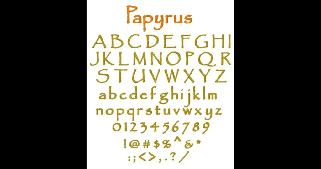
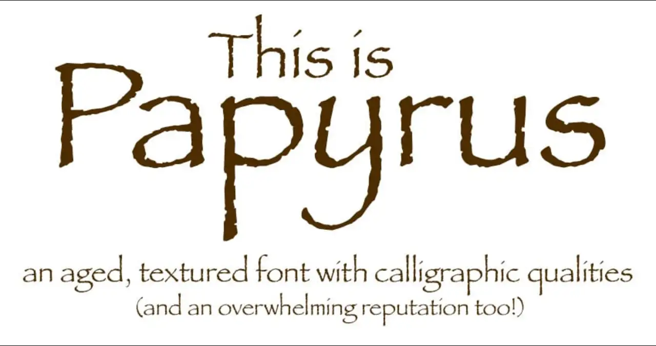
The Papyrus font is one of the most recognizable typefaces in the world, known for its distinctive, hand-drawn appearance that evokes ancient scripts. Designed in the early 1980s, it has been both celebrated for its unique aesthetic and criticized for its overuse in various media. This article explores the history, design characteristics, cultural significance, and the ongoing debate surrounding the Papyrus font.
The Genesis of Papyrus Font
The Papyrus font was created in 1982 by Chris Costello, a young graphic designer with a passion for calligraphy and ancient scripts. At the age of 23, Costello embarked on a project to design a typeface that would resemble what English text might have looked like if written on papyrus 2,000 years ago. He hand-drew the font over six months using a calligraphy pen on textured paper, aiming to capture the essence of biblical-era manuscripts.
In 1983, the font was released by Letraset, a company known for its dry transfer lettering sheets. Later, it was licensed by Linotype and included in various software packages, leading to its widespread availability on personal computers. Costello sold the rights to Papyrus for a modest sum and has since expressed surprise at its global proliferation.
Distinctive Design Features
The Papyrus font is characterized by its rough edges, irregular curves, and high horizontal strokes in capital letters. These features give it a hand-crafted, ancient appearance, aligning with Costello’s original vision. The font’s textured look is reminiscent of ink on papyrus, contributing to its unique aesthetic.
Despite its rustic charm, Papyrus has been criticized for certain design flaws. Typographers have pointed out issues with its readability, especially in all-caps or long text blocks. The font lacks multiple weights and styles, limiting its versatility in design applications.
Cultural Significance and Popularity
The Papyrus font gained significant attention when it was used in the title and subtitles of James Cameron’s 2009 film “Avatar.” This high-profile usage sparked discussions about the font’s appropriateness and led to widespread recognition. A 2017 “Saturday Night Live” sketch featuring Ryan Gosling humorously criticized the choice, further cementing Papyrus’s place in pop culture.
Beyond cinema, Papyrus has been Papyrus Font in various contexts, from restaurant menus to product packaging. Its association with exoticism and antiquity has made it a popular choice for businesses aiming to convey a sense of tradition or mystique. However, this widespread use has also led to perceptions of the font being clichéd or overused.

The Controversy Surrounding Papyrus
While the Papyrus font has its admirers, it has also faced significant criticism from the design community. Many designers argue that its overuse and application in inappropriate contexts have diminished its impact. The font’s distinctive appearance can clash with modern design aesthetics, leading to its reputation as one of the most “hated” fonts, alongside Comic Sans.
Despite the backlash, some defend Papyrus, noting that its design, when used thoughtfully, can still be effective. They argue that the font’s unique characteristics can add value when applied in suitable contexts, such as historical or fantasy-themed projects.
Appropriate Usage of Papyrus
Given the controversy, it’s essential to consider when and how to use the Papyrus font effectively. Designers recommend employing it sparingly and in contexts where its ancient, hand-crafted look aligns with the project’s theme. For instance, it may be suitable for branding related to natural products, historical exhibits, or fantasy literature.
However, for professional documents, modern branding, or digital interfaces, alternative fonts with cleaner lines and better readability are often preferred. Understanding the font’s strengths and limitations is key to making informed design choices.
Conclusion
The Papyrus font remains a polarizing typeface in the design world. Its distinctive aesthetic has made it both a popular choice for evoking antiquity and a subject of criticism for its overuse and design flaws. By understanding its origins, characteristics, and cultural impact, designers and users can make more informed decisions about when and how to use Papyrus effectively.


